Building a JavaFX Search Bar


Introduction
Lots of desktop software applications such as word processors and web browsers include a search facility to allow the user to quickly find a word in another part of a document. In this article I show how to build the JavaFX user interface for a search bar.
You’ll learn about using FontAwesomeFX to add beautiful icons to your JavaFX application, about how ControlsFX provides new and interesting user interface controls and about some useful techniques that should be applicable in lots of different types of project.
The VocabHunter Search Bar
The search bar presented in this article is part of VocabHunter, an Open Source JavaFX desktop application for learners of foreign languages. You can see the application with the search bar open here:
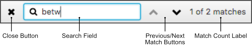
Zooming in a little, here is the search bar on its own:

The search bar was added to version 1.0.19 of VocabHunter and the code and links in this article are fixed to that version so that the references don’t go stale as the project evolves over time. VocabHunter is Open Source and the complete project is available on GitHub. For more details on the software itself, take a look at the VocabHunter website.
JavaFX and ControlsFX
JavaFX provides a wide range of user interface components and many of these are employed in VocabHunter to give a rich user experience. You can find an overview of how JavaFX has been used in the project in the article I wrote on the King Tech Blog: How JavaFX was used to build a desktop application. In addition to the standard JavaFX components, the VocabHunter search bar also uses user interface components from various Open Source libraries.
ControlsFX is a great Open Source library of JavaFX components. The search bar uses one of the components, the CustomTextField, to show an icon in the search field and thus make the intention of the field clear to the user:
Elsewhere in the VocabHunter user interface you will find further uses of ControlsFX. If you are interested in finding out more about the components on offer for your project, try out the sample application included with ControlsFX.
FontAwesomeFX
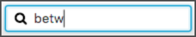
FontAwesomeFX makes it easy to include icons from the Font Awesome collection (amongst other collections) in a JavaFX application. This is great news if you would like to take advantage of some well-known visual metaphors or if you simply don’t have the time or inclination to draw out your own icons. Furthermore, the icons are all vector graphics and will scale nicely with your user interface. For just a small taste of what is available, here are the Font Awesome icons used in the VocabHunter search bar:
If you want to experiment with FontAwesomeFX, find icon names or see what is available, try out the FontAwesomeFX Glyphs Browser.
Basic Structure of the Search Bar
The VocabHunter user interface is principally defined in FXML files. FXML is an XML-based language for describing the components and layout in a JavaFX user interface. The definition of the VocabHunter search bar can be found in session.fxml and has the following structure:
<ToolBar fx:id="barSearch">
    <items>
        <Button fx:id="buttonCloseSearch" ... />
        <CustomTextField fx:id="fieldSearch" ... />
        <Button fx:id="buttonSearchUp" ... />
        <Button fx:id="buttonSearchDown" ... />
        <Label fx:id="labelMatches"/>
    </items>
</ToolBar>
Where possible, I have put the basic structure in the FXML and then use CSS to define details of styling and spacing. To try to keep the structure as flexible as possible, the icons that are used are defined in the CSS rather than directly in the FXML. The file main.css contains the definitions of the icons along with all of the other VocabHunter styles.
The Search Bar Buttons
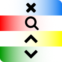
The search bar contains three buttons:

You can see the outline of the search bar FXML in the previous section. Expanding the outline, the first of the buttons (the “x” for closing the search bar) is defined as follows:
<Button fx:id="buttonCloseSearch" styleClass="buttonSearchClose">
    <graphic>
        <FontAwesomeIconView styleClass="buttonSearchCloseIcon"/>
    </graphic>
</Button>
The definitions for the remaining two buttons are almost identical. As you can see a FontAwesomeIconView is used so that an icon can be displayed. I’ve taken the approach of using CSS to define the actual icon that is used in each case. In the case of the close button, the style class for the icon is given in the above FXML as buttonSearchCloseIcon and you can see how this is defined in the CSS file main.css:
.buttonSearchCloseIcon {
    -glyph-size: 15;
    -glyph-name: CLOSE;
}
Here the FontAwesomeFX icon name CLOSE is given, along with the icon size.
By default, JavaFX will add a standard border to each button. In the case of the search bar buttons, they look better without the borders and these are removed with CSS:
.buttonSearchClose, .buttonSearchUp, .buttonSearchDown {
    -fx-background-color: transparent;
    -fx-background-insets: 0;
}
The Search Field
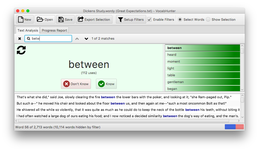
Central to the search bar is the search field itself where the user enters the word, or part of the word, that they are looking for:

This JavaFX text field has something extra to make its intended use clear: a magnifying glass icon. The ControlsFX CustomTextField allows you to add components into the text field which is perfect for this purpose. The search field is defined in the FXML file session.fxml as follows:
<CustomTextField fx:id="fieldSearch" styleClass="searchField">
    <left>
        <Label styleClass="searchBoxLabel">
            <graphic>
                <FontAwesomeIconView styleClass="searchBoxLabelIcon"/>
            </graphic>
        </Label>
    </left>
</CustomTextField>
As you can see, the CustomTextField is defined like a standard JavaFX TextField but in addition has a <left> property used here for the magnifying glass icon.
Just as for the buttons described in the previous section, the actual icon used is defined in the CSS file main.css. Also the spacing around the icon is included in CSS:
.searchBoxLabel {
    -fx-padding: 0 2 0 7;
}
.searchBoxLabelIcon {
    -glyph-size: 13;
    -glyph-name: SEARCH;
}
In this case the FontAwesomeFX name for the magnifying glass icon is SEARCH.
Highlighting Errors
The label on the right-hand side of the search bar shows information about the number of matches or “No matches” in the case where the search does not produce any results. In addition to the “No matches” message, the search field also changes colour to make it immediately obvious to the user that no results can be found:

This colour change is handled using a CSS pseudo-class, defined in main.css:
.searchField:fail {
    -fx-background-color: -colour-search-fail;
}
The Java part of the pseudo-class definition can be found in SearchFieldClassTool:
private static final PseudoClass CLASS_FAIL
    = PseudoClass.getPseudoClass("fail");

public static void updateStateClass(final Node node,
                                    final boolean isFail) {
    node.pseudoClassStateChanged(CLASS_FAIL, isFail);
}
A listener in SearchHandler is then used to switch the pseudo-class on and off:
searchModel.searchFailProperty().addListener((o, n, v) ->
    SearchFieldClassTool.updateStateClass(fieldSearch, v));
Closing Words
With JavaFX you can easily add attractive and useful elements such as the search bar described here to your program. I’m sure you’ll find as I have that FontAwesomeFX and ControlsFX are two great libraries that you can use to add some flair to your user interface.
Finally, VocabHunter is Open Source so please do fork the project on GitHub and experiment with it. I hope that you find it useful and I’d welcome your feedback and code contributions!
Related Articles
- Installable Java Apps with jpackage
- Migrating to JUnit 5
- Read (Almost) Any Document in Java
- How JavaFX was used to build a desktop application (King Tech Blog)
- User Interface Testing with TestFX
- Dependency Injection in JavaFX
- VocabHunter – A tool for learners of foreign languages (King Tech Blog)
- Open Source & Secret Santa with Santulator (King Tech Blog)